Website Design
I have a degree in Information Technology from UMass Lowell, where I began exploring website design as part of my coursework. After graduation, I was invited to revamp the Mill Cities Relay website, which was in desperate need of an upgrade, and I was one of the few members of the Mill Cities Alliance with experience in web development. Since then, I’ve expanded my work to include websites for small businesses and independent professionals, focusing on clean design, usability, and functionality that meets real-world needs.
If you have a small business or project that could benefit from a website that looks great and works smoothly, let’s talk about how I can make that happen.

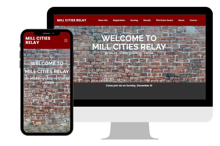
Mill Cities Relay

The Challenge
Create a modern, user-friendly website for a long-running regional relay race while preserving its legacy identity. The site needed to support mobile users, streamline race registration, and ensure accurate, up-to-date race information without requiring constant manual updates.

The Approach
Developed a dynamic website structure with automated yearly updates for key race data (such as dates and deadlines), reducing manual maintenance and minimizing the risk of outdated information. Designed the site with a mobile-first approach and simplified navigation to improve usability for runners, volunteers, and organizers.

The Impact
Reduced the need for annual manual updates, improving reliability of race information. Created a more accessible and mobile-friendly experience for participants, supporting easier registration and race-day planning.
Key Features
Clear Information Hierarchy
Reorganized content to separate runner, volunteer, and general race information, improving usability and reducing friction.
Reduced Manual Admin Work
Simplified backend updates so non-technical organizers can manage the site with minimal effort.
Automated Race Date Management
Built logic to automatically update recurring race dates each year, eliminating the need for manual edits and reducing the risk of outdated information.
Mobile-First Navigation
Designed navigation with mobile users in mind, prioritizing quick access to registration, race details, and logistics.
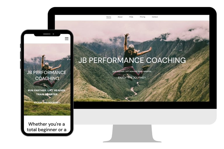
JB Performance Coaching
The Challenge
Create a website for an online running and fitness coach that clearly communicates her expertise while capturing her energetic, positive personality. The site needed to build trust with potential clients, differentiate her services, and support a seamless purchasing experience for coaching packages.
The Approach
Designed a brand-forward website that balances professionalism with an approachable, high-energy tone. Structured the site to highlight coaching philosophy, credentials, and client value, while guiding users toward clear calls-to-action.
Integrated secure payment processing using Stripe to enable direct purchase of coaching services, simplifying the onboarding process for new clients.
The Impact
Created a cohesive online presence that strengthens credibility and makes it easy for potential clients to understand and purchase coaching services. Streamlined the client conversion process by reducing friction between discovery and sign-up, supporting a more efficient and scalable business model.
Key Features
Integrated Payment Processing
Implemented secure checkout flows using Stripe, enabling users to purchase coaching packages directly through the site.
Conversion-Focused Layout
Designed pages with clear calls-to-action and logical flow, guiding users from introduction to purchase with minimal friction.
Clear Service Positioning
Structured content to clearly differentiate coaching offerings, making it easier for users to understand options and choose the right fit.
Brand-Driven Design
Developed a visual style and tone that reflects the coach’s energetic and encouraging personality, helping the site stand out and connect with its target audience.
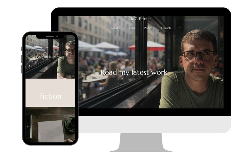
Author B. C. Ferriter
The Challenge
Design a minimalist author website that reflects the client’s aesthetic preferences while still effectively presenting him and his work. A key challenge was encouraging the author to position himself as the central focus of the site.
Additionally, the site needed to display poetry with precise line breaks and indentation, which can be difficult to preserve consistently across desktop and mobile browsers. The site also needed to immediately highlight the author’s recent work for publishers, who expect to find it quickly.
The Approach
Developed a clean, minimal design aligned with the author’s vision while also emphasizing his identity and work. Created a prominent header that features a direct link to his most recent work, ensuring publishers can access key content immediately without scrolling.
Implemented a presentation approach for poetry pages that preserves exact line breaks and indentation across devices, maintaining the integrity of the writing.
The Impact
Delivered a site that balances artistic minimalism with strategic presentation, helping the author feel comfortable while ensuring publishers can quickly access his most relevant works.
Maintained consistent poetry formatting across devices, providing a reliable and professional reading experience.
Key Features
Cross-Device Consistency
Ensured formatting and layout were maintained between desktop and mobile to provide a reliable reading experience.
Publisher-Centered Header
Designed a header that links directly to the author’s most recent work, allowing publishers to access key content immediately.
Minimalist, Author-Focused Design
Created a clean visual style that reflects the author’s preferences while guiding attention toward his identity and work.